Every Friday at Bitmetric we’re posting a new Qlik certification practice question to our LinkedIn company page. Last Friday we asked the following Qlik Data Architect certification practice question about picking the right visualizations for your Qlik Sense dashboard:
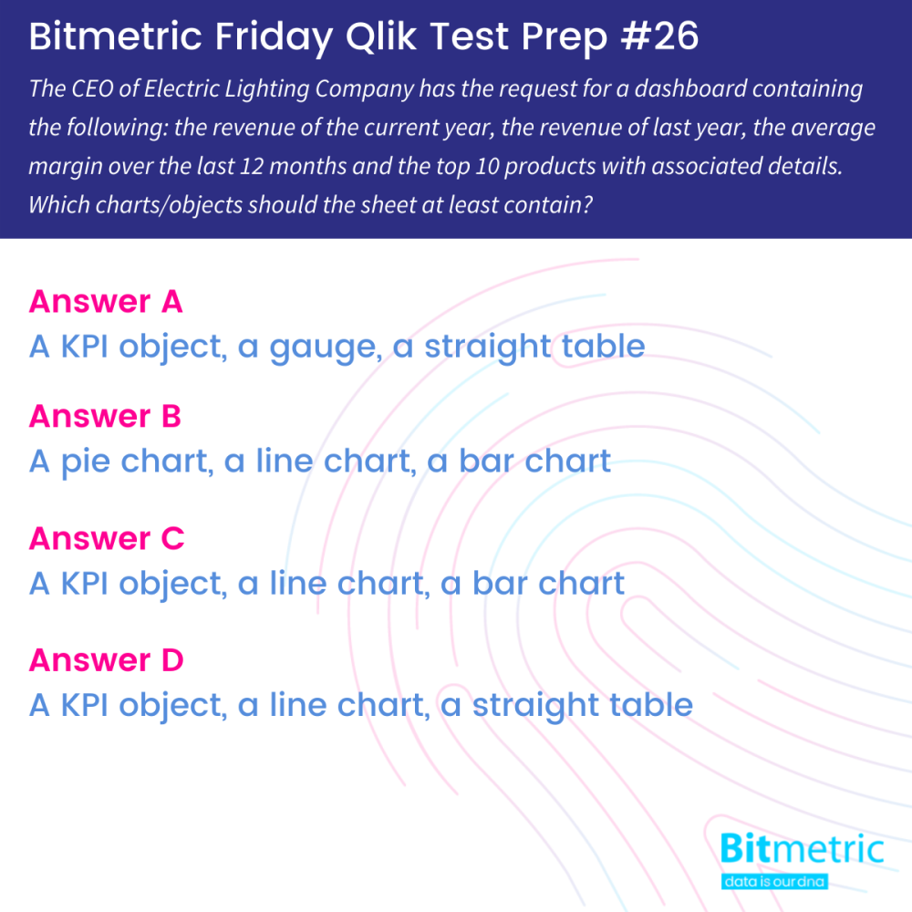
The correct answer is D: A KPI object, a line chart, a straight table
There is always a part of personal preference in creation and design of Qlik apps. However, if we want to follow the given requirements closely, then the right answer needs to contain a straight table. Let’s have a look at all four options and see how they stack up against the given requirements:
- The revenue of the current year and last year
- The average margin over the last 12 months
- The top 10 products with associated details
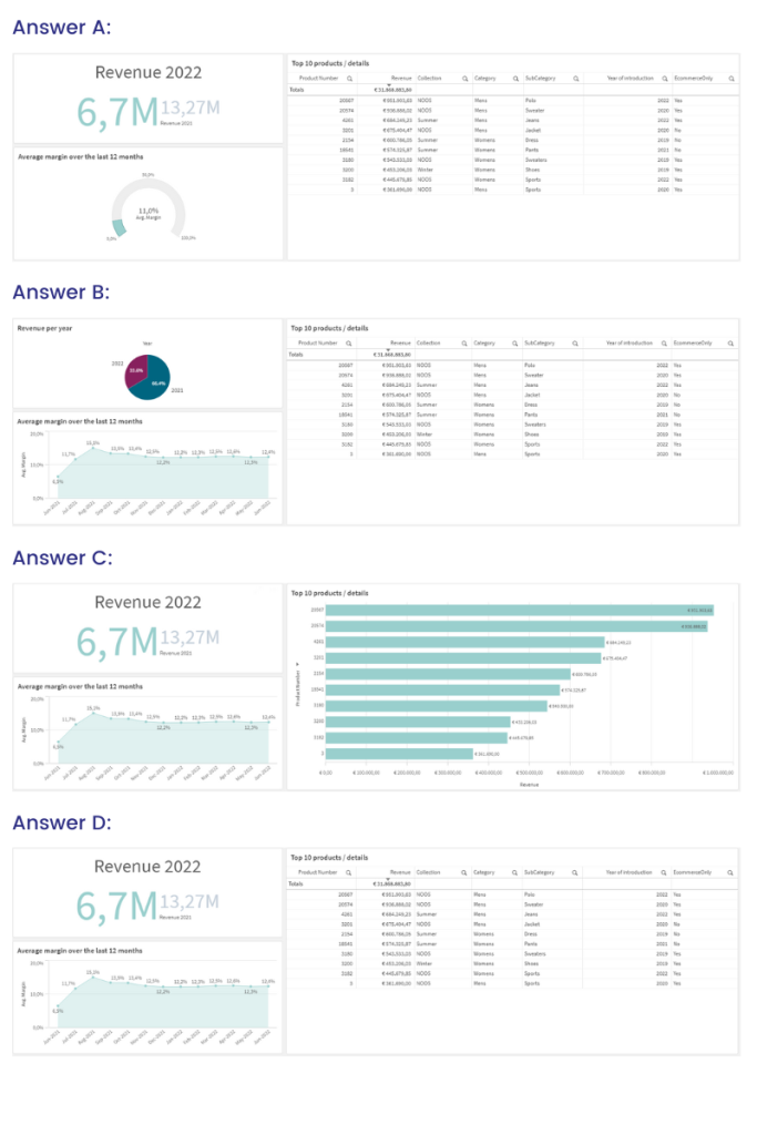
Below you can see each answer visualized in a small dashboard:
Now let’s see how well each of these matches the requirements.
The revenue of the current year and last year
The revenues for the current and previous year ar most clearly visualized in a KPI Object.
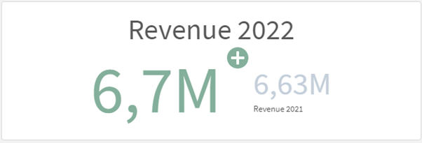
The request for the revenues of the current year and previous year are most clearly visualized in a KPI Object. It will show the amount of revenue clearly where current year is shown as the primary KPI and the sales of the previous year as the secondary KPI.
In this question the requirements are followed to the letter, but we could improve on this by adding a year to date comparison to the object. Comparing the same period in the last year with the same period in the current year will give us a better understanding of how good, or bad, the results are.
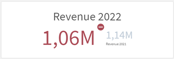
We could also improve on this visually by using the measure for the revenue last year as limit for the conditional color. This gives a visual representation of whether the revenue of the current year is above or below last year:
The pie chart (answer B) representing the revenues of each year only shows how these values are divided between the years. Not very applicable for understanding how much revenue is created. If we apply the same trick and create a YTD overview of the pie chart, while it does create a visual representation of which year currently has the bigger part of the pie, the most important request, the actual revenue, is not visible.
The average margin over the last 12 months
The next request is to show the average margin of the last 12 months. While technically the gauge shows this measure, there is not much point in showing it like this. The gauge object is meant to fill up to a certain value and show how far along you are, more like a speedometer in a car for example.
In this case a measure like average margin is more or less likely to hover around a single value, negating the visual effect of the gauge. Also while the value shown is indeed the average over the last 12 months, there is no clear way to check and know that, the months are not visible after all in a gauge. Using a line chart makes it immediately visible over which months the margin is shown, as well the change over time. In this case while the average is around 11%, we can see that around June, July and August 2021 things have greatly improved the margin going forwards, making it able to analyze what these changes were or whether certain business changes have indeed resulted in the desired effect.
The top 10 products with associated details
And then finally the chart with most debate. While we agree that for a quick glance management overview Answer C is the best and visually clearest solution. However, the request in the requirements clearly stated that the top 10 products with associated details were to be shown. In this case a straight table will contain those. However we have no doubt in your abilities to find a great solution and convince the business of better solutions.
That’s it for this week. See you next Friday?
More from the Bitmetric team

Qlik Cloud Backup
Protect your investment in Qlik with daily incremental backups stored in an encrypted environment with redundant storage. Available for as little as 2 Euro per day. Learn more.
Join the team!
Do you want to work within a highly-skilled, informal team where craftsmanship, ingenuity, knowledge sharing and personal development are valued and encouraged? Check out our job openings.
